Most podcast covers are designed at full size and then forgotten. The trouble is that listeners almost never see them at full size. They see a square thumbnail in a grid of twenty other shows, and they decide in less than a second whether to look closer.
A cover is the show’s only consistent visual ad. As a podcast production agency, we watch how covers actually perform across hundreds of shows. The patterns are remarkably consistent, and most of them have little to do with taste.
This guide walks through what actually works in podcast cover design. It covers the technical specs, the readability tests, and the mistakes that hide a show inside its own art.
Resonate Recordings has produced more than 50,000 episodes since 2014 for brands ranging from startups to companies like Amazon, Salesforce, and Stanford. The notes below come from running real shows for real clients, not from theory.
What a Podcast Cover Actually Has to Do
Before any design choices, it helps to name the job. The cover does three things, and they are often in tension.
It Has to Read at a Thumbnail
Podcast apps display covers as small squares, often under 60 pixels wide on a phone. If the show name disappears at that size, the cover fails its first test.
Designers usually work at 3,000 by 3,000 pixels because Apple Podcasts requires that size. The mistake is judging the design at that scale. Always view it at the real display size first.
The thumbnail test is unforgiving. We routinely shrink a finished cover to 60 pixels wide and view it next to a random selection of charting shows. If our show fades into the grid at that size, the design is not done.
It Has to Match the Show’s Actual Voice
A polished, corporate cover on a casual interview show feels off. A scrappy hand-drawn cover on a serious investigative show feels worse. The cover sets an expectation the first episode has to meet.
If the cover looks like one show and the audio sounds like another, the listener loses trust in less than a minute. The two need to match.
Consistency matters as much as accuracy. If the cover, the audio, and the show description all tell the listener slightly different stories, the show feels confused before episode one even plays.
The Technical Specs That Matter
Before any design work, the specs need to be right. Apps reject or downgrade covers that miss them.
Size, Format, and Colour Space
Apple Podcasts requires a 3,000 by 3,000 pixel square in JPEG or PNG format, in the RGB colour space. Spotify and the other major apps accept the same file. There is no reason to design at any other size.
Some shows export at 1,400 by 1,400 because that was the old standard. That size no longer meets Apple’s requirement and can hold a show back from charts and featured placement.
Designers exporting from print software sometimes default to CMYK. Apple Podcasts rejects CMYK files outright. A quick check of the colour space saves a rejection during the launch week.
Safe Zones and File Size
Some apps crop the corners of the cover. Keep the show title and any critical elements inside a smaller safe zone in the middle, not pressed against the edges.
The file should be optimised but not aggressively compressed. Aim for under 500 kilobytes if possible, but never at the cost of obvious banding or fuzz.
Different platforms crop different corners. Pinning text and faces to the exact centre is the safest bet. Treating the outer ten percent as a buffer keeps the cover looking deliberate across apps.
Typography Carries More Weight Than the Imagery
Most podcast covers live or die on the show title. The font choice, the weight, and the spacing usually matter more than any illustration.
Pick One or Two Fonts and Commit
A cover with three or four typefaces feels chaotic at any size. Pick one strong display font for the show name and at most one supporting font for a subtitle. Skip the rest.
Heavy, condensed sans-serif fonts read best at thumbnail. Light, delicate fonts tend to disappear. If the design hinges on a thin elegant font, test it at thumbnail before committing.
Licensing matters too. Many free fonts forbid commercial use, which a branded podcast almost always qualifies as. Pay for the typeface or pick an open-licensed alternative.
Show Title Comes First, Then the Subtitle
The show title should be the largest, most prominent element. A subtitle or tagline can sit underneath at a smaller size, but it should never compete with the title.
Many covers waste space on the host’s name in big letters. Unless the host is the draw, demote the name. We work on this when we set up shows through our podcast launch service. The title hierarchy is usually the first fix in any cover review.
Always type out the actual show title in the design, not lorem ipsum. Real text reveals kerning problems, line-break choices, and the visual weight of the words you actually have to live with.
We also keep a small library of cover briefs that worked, anonymised, to share with designers. Showing what a clear brief looks like usually saves more time than any amount of explanation.

Imagery That Works at a Thumbnail
Imagery is the second decision after typography. Most covers add too much, not too little.
One Strong Visual Idea, Not Five
The best covers carry one visual idea. A single bold colour. A single shape. A single portrait. Multiple competing elements look fine at full size and turn into mud at thumbnail.
If the design has more than two or three distinct elements, cut one. The discipline of removing carries more weight than the discipline of adding.
The clearest covers in any category usually share one visual move and nothing else. Our review of the best branded podcasts shows how varied that single move can be while still reading clean.
Portraits, Logos, and Abstract Marks
Interview shows often benefit from a clear host portrait, which gives a face for listeners to remember. Branded podcasts often use a strong logo treatment. Narrative shows often use abstract marks tied to the theme.
Pick the approach that fits the show. Mixing all three rarely works. A portrait with a busy logo and an abstract background reads as none of those things.
Whichever approach you pick, commit to it. A portrait that is also a logo is rarely either. Listeners need a quick visual anchor, not a designed compromise.
The mark you pick also affects what video formats can do later. Our notes on audio vs video podcasting in 2026 cover how visual identity translates between audio thumbnail and video cover.
Common Podcast Cover Design Mistakes
A few mistakes show up across the apps. Knowing them in advance is the easiest way to avoid them.
Microphones, Headphones, and Other Tired Visuals
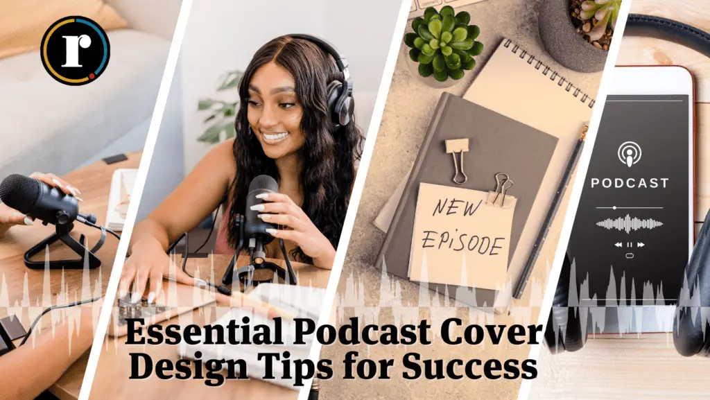
A picture of a microphone on a podcast cover is the audio equivalent of a picture of a book on a book cover. It tells the listener the show is a podcast, which they already knew.
Cut the obvious. The cover space is too small to waste on signalling the format.
There are exceptions. A show explicitly about microphones, recording, or audio gear can use the imagery deliberately. The rule is to avoid signalling the format when the format is not the subject.
Tiny Text and Cluttered Layouts
The most common technical mistake is text that reads fine at full size and disappears at thumbnail. Always check at the smallest display size before publishing.
A cluttered cover often comes from a brief that did not narrow the idea down. The fix usually happens upstream. Our podcast readiness assessment surfaces this kind of unclear brief before designers ever open Figma.
When the brief is unclear, designers often add elements to compensate. The fix is upstream. A clearer brief, written before any design work begins, prevents most of the clutter that ends up on the cover.
How to Plan a Cover Before You Brief a Designer
A clear brief produces a clear cover. The shows with great art usually have owners who answered a few questions before any design work began.
Answer Three Questions on a Page
Before any design, write down three things. Who is the listener? What should the cover make them feel in one glance? Which existing covers do you wish yours stood next to? Those three answers make the brief useful.
Hand that page to the designer. The covers that come back will be sharper than anything produced from a mood board alone.
Existing covers you admire are a better brief than abstract mood boards. They give the designer real targets and constraints. They also surface taste mismatches before the work goes wrong.
Test at Real Size Before Approving
Before approving any cover, view it on a phone next to other shows in the same category. If it does not stand out in that grid, it will not stand out for a real listener.
A clean cover is also the moment to think about distribution. Our podcast hosting platform pushes the cover to every major app so the version that wins your review is the version listeners see everywhere.
Review the cover in the actual environment where listeners will see it. Open Apple Podcasts or Spotify, scroll your category, and look honestly. The differences between covers that work and covers that do not are easy to spot at that scale.
A Great Podcast Cover Does Less, Done Well
The shows with covers that actually work share a discipline. One strong title. One clear visual idea. Tested at the real size before publishing. None of it is design magic. All of it is restraint.
If you want help planning the cover and the show alongside it, book a podcast strategy call with our team.
For more on getting the show in front of listeners, see our guide to marketing your podcast. The review of the best podcast apps covers where covers actually compete for attention.